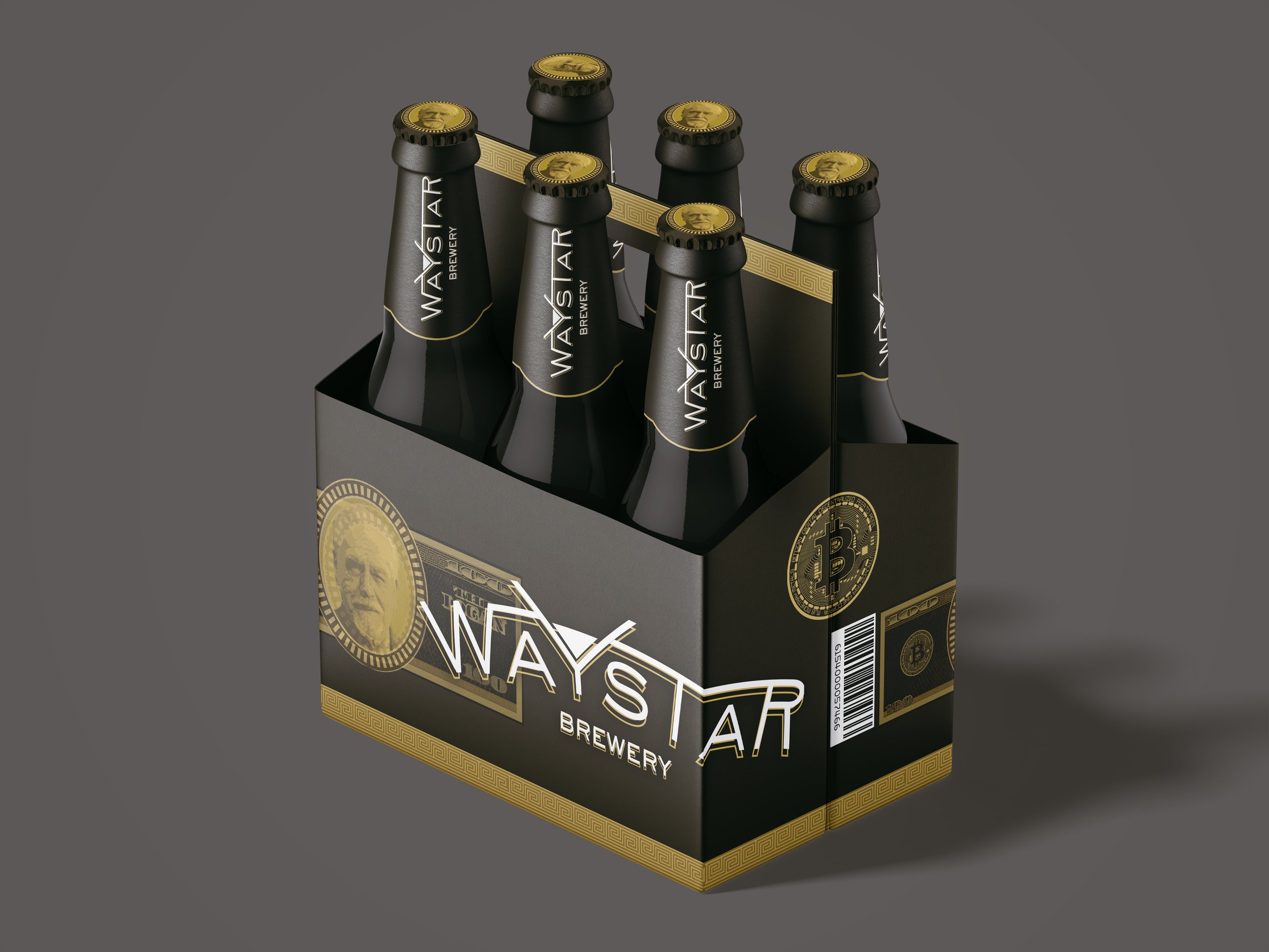
Beer Project - Waystar Brewery | Packaging
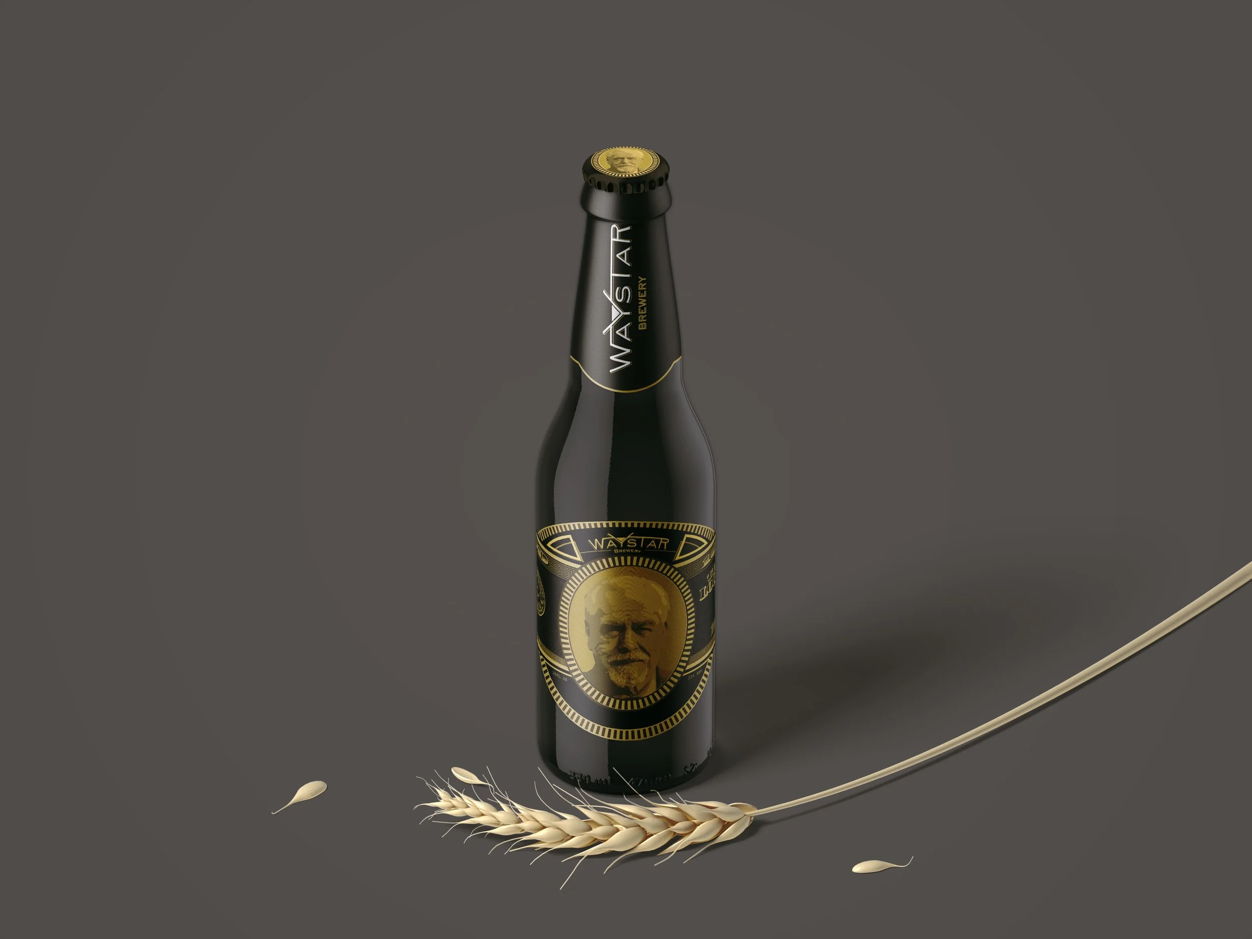
For this typography project, we were tasked with selecting a theme of our choice and designing a beer bottle and packaging around it. As an avid TV enthusiast, I chose to base my design on one of my favorite shows, Succession. This project allowed me to merge my passion for the show with my interest in typography and design.
After selecting my theme, I began by researching the primary font associated with Succession—Sackers Gothic. I experimented with various manipulations of the font until I arrived at a version that felt right for the logo. Once I decided on a name for the beer, I used Adobe Illustrator to refine the font further and combined it with visual elements related to the show to create a distinctive logo.
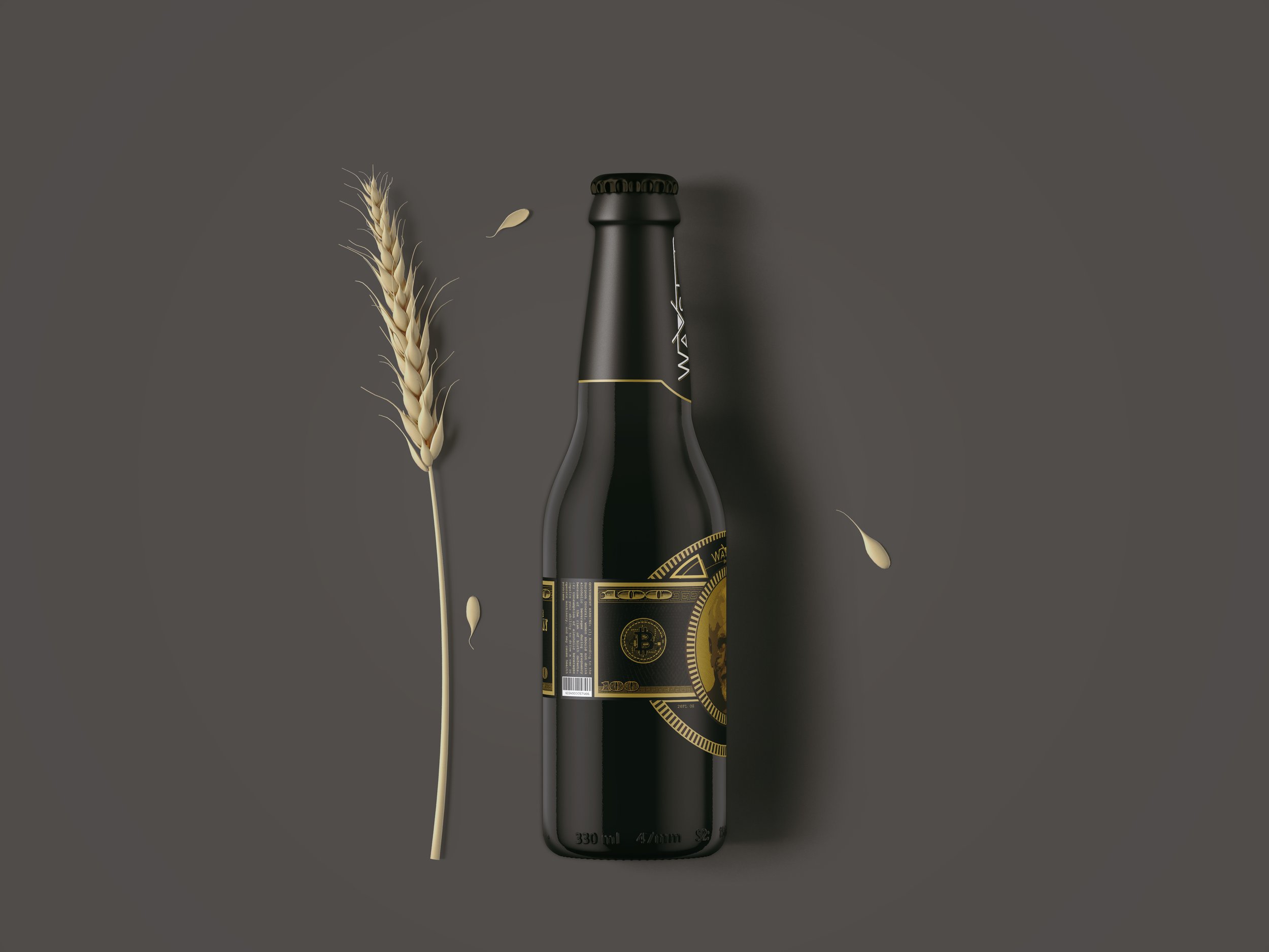
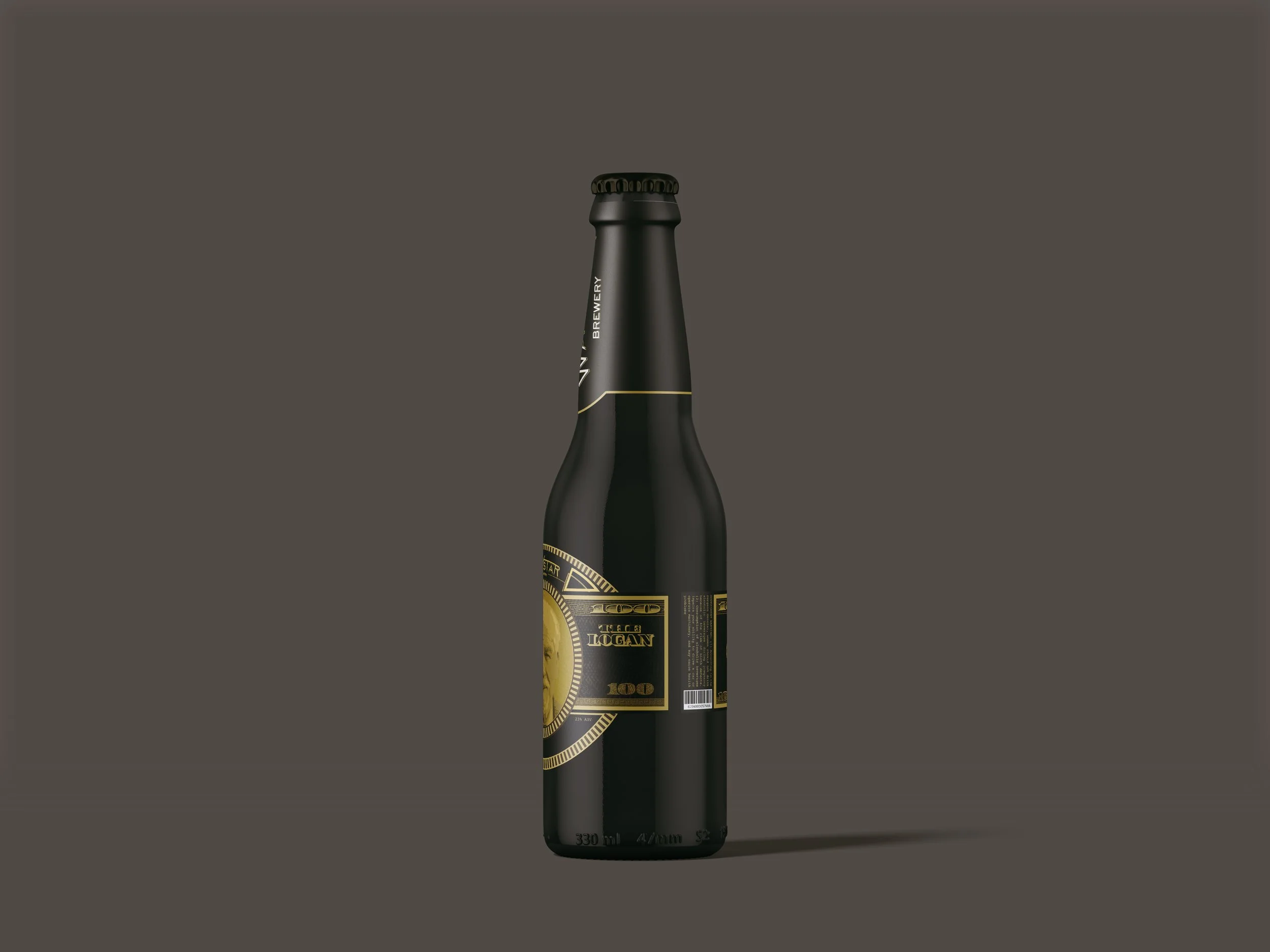
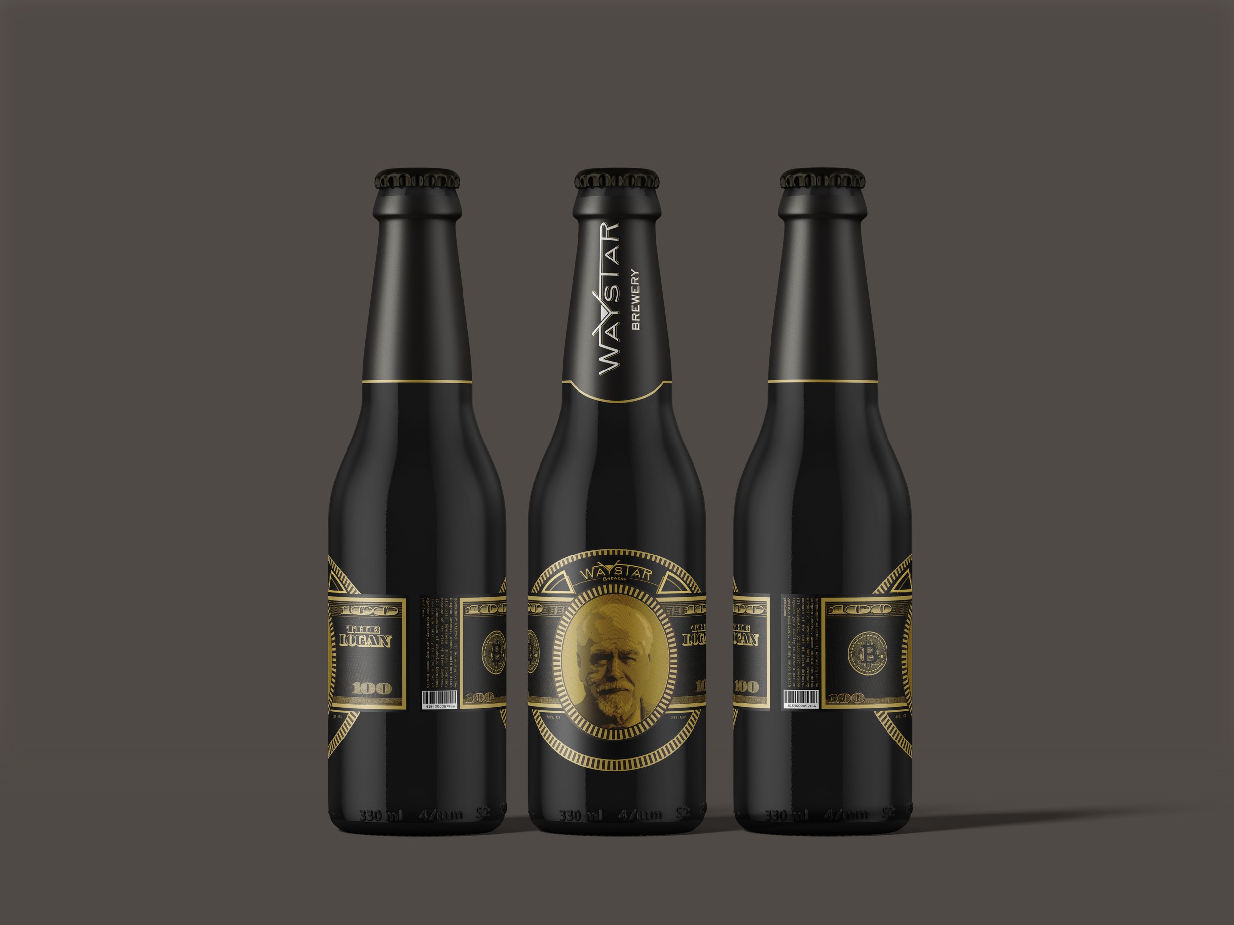
Next, I mocked up the logo onto beer bottles, carefully selecting a color scheme that captured the luxurious yet melancholic tone of Succession. This included choosing colors for both the text and the bottle itself. Finally, I extended the design to the beer packaging, ensuring a cohesive and sophisticated presentation.
This project was a valuable challenge that deepened my appreciation for the power of typography in design. It pushed me to think critically about how type can convey a brand's essence and set the tone for an entire product experience.