Succession // Waystar Brewery
For this typography-focused project, the assignment was simple: choose a theme and design a beer bottle and packaging around it. The freedom to choose meant I could merge two loves — television and design — so I naturally turned to Succession, one of my favorite shows, as the foundation for the brand. The task became an opportunity to explore how typography and tone work hand in hand to shape perception.
Client
SCAD
Category
Art Direction

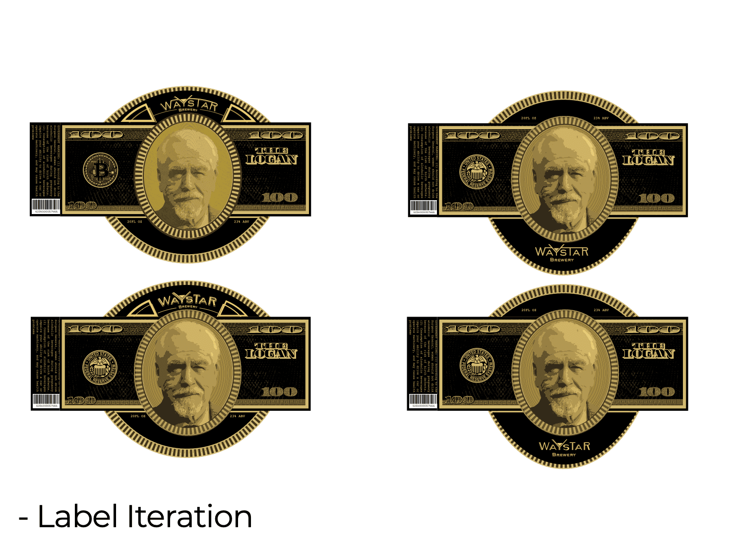
Inspired by the cold, corporate world of the Roy family, the concept centered on capturing the show’s sleek, high-society tension in the form of a craft beer brand. I wanted the bottle to feel expensive, calculated, and a little emotionally unavailable — just like its muses. From the name to the color palette to the typography itself, every choice was about creating a brand that echoed the power, melancholy, and restraint of Succession.
I began by dissecting Succession’s iconic title font — Sackers Gothic — and played with its form to make it feel more unique while maintaining its sharp authority. Using Adobe Illustrator, I refined the custom letterforms and paired them with supporting graphics that felt appropriate to the show’s visual world. I selected a deep, muted color palette — rich greens, blacks, and golds — and mocked up the final label onto beer bottles and packaging.

The creative challenge here was not just about mimicking an existing aesthetic but translating the intangible mood of a TV show into something tactile and consumable. I needed the beer branding to feel like Succession without becoming a parody — to channel its quiet drama into type, form, and finish.
By treating the project less like a novelty and more like an authentic brand exercise, I created a packaging design that could live on shelves — not just as a show tribute, but as a fully-realized, premium beer concept. The final product evokes a sense of icy luxury, carried by typography that both respects and reinterprets the show's visual legacy. It was a passion project that reminded me how powerful type can be in setting the emotional tone of a brand.


